Ringle
|
#App revamp
#Awards
How can Ringle turn AI Phone practice into a guided learning loop users would pay for?
Duration
8 Weeks
Theme
Trust Recovery
Review Structure
Role
UX/UI Design, User Research, Prototyping, Usability Test
Tools
Figma, Figjam
PROJECT OVERVIEW
Ringle is a premium 1:1 English learning platform that connects learners with tutors from Ivy League and other top global universities. As AI-powered English learning services continued to grow, Ringle needed to bring its core strengths in expert feedback and high-quality learning into a more flexible AI-based experience. This project focused on designing Ringle AI Speaking, helping users practise English conversations tailored to their work, academic, and career contexts, and continue improving through personalised feedback.
BUSINESS CONTEXT
20%
Market Share Goal
Ringle aimed to reach 20% market share in Korea’s adult AI English learning market.
B2C
Growth Opportunity
Ringle had grown mainly through B2B, but wanted to use AI to build a stronger position in the B2C market.
Focused Direction
Strategic Choice
Rather than following its existing internal strategy, Ringle expected a fresh external perspective on the target audience and product direction.
STRATEGY GROUNDWORK
Clarifying what Ringle actually needed
Before starting the project, we reviewed Ringle’s guide webinar and Q&A to clarify the company’s goals and constraints.  We kept both AI Tutor and AI Phone open until the survey and interviews, so we could choose the direction users needed more and Ringle could grow faster toward its 20% market share goal.
Defining a Target That Could Convert Faster
01.
Our strategy was to find users who were more ready to pay, not simply the largest audience.
02.
New users offered growth potential, but many were still relying on free or cheaper options, making them harder to convert early.
03.
Users who needed English now and had already tried other learning methods seemed more likely to pay for Ringle AI Speaking.
04.
Based on this, we shaped our survey and interviews around this group to learn what could lead them to their first purchase.
USER SURVEY & INSIGHTS
Exploring What Stops Continued Use
We ran a user survey to understand users’ English needs, AI usage, post-session behaviour, feedback perception, and barriers to continued use. The results showed that users needed English and were already familiar with AI, but Ringle AI was not yet turning into a regular learning habit.
1:1 IN-DEPTH USER INTERVIEW
Exploring the Gap Between Need and Action
We first needed to find users who were more likely to pay sooner. The survey showed that users needed English and were familiar with AI, but were not studying consistently. So, the interviews focused on where and why users stopped.
AFFINITY MAPPING
Turning patterns into product opportunities
To analyse the qualitative data from 1:1 interviews, we used Affinity Mapping to make sense of scattered user voices and identify meaningful patterns across participants. By looking beyond individual comments, we translated repeated needs, barriers, and behaviours into clear product opportunity areas.
Key Insights from Affinity Mapping
01.
The closer users were to real English situations, the more anxious and ready to pay they became
Users who needed English soon were more anxious and more ready to pay. Their goal was not general improvement, but avoiding mistakes in real situations.
02.
Users with urgent goals wanted guidance on what to practise, not open-ended conversation
Users who needed English soon were more anxious and more ready to pay. Their goal was not general improvement, but avoiding mistakes in real situations.
03.
Feedback needed to guide the next step, not just show results
Users liked Ringle AI’s detailed feedback, but often dropped off because it did not clearly guide what to do next. Feedback needed to turn past mistakes into the next practice.
04.
Users were willing to pay if Ringle gave them a clear reason to choose it over free AI tools
Even with free AI tools available, users were open to paying for Ringle if it offered clear value. They also found AI less pressuring than human tutors, making it easier to start speaking practice.
PROBLEM STATEMENT
Lack of post-feedback guidance prevents users from building habits and converting to paid plans.
EMPATHY MAP & USER PERSONA
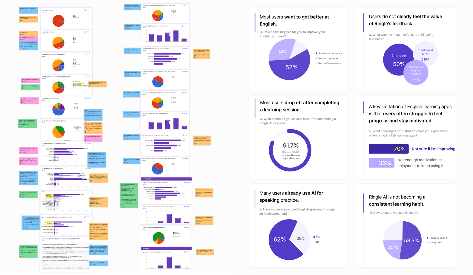
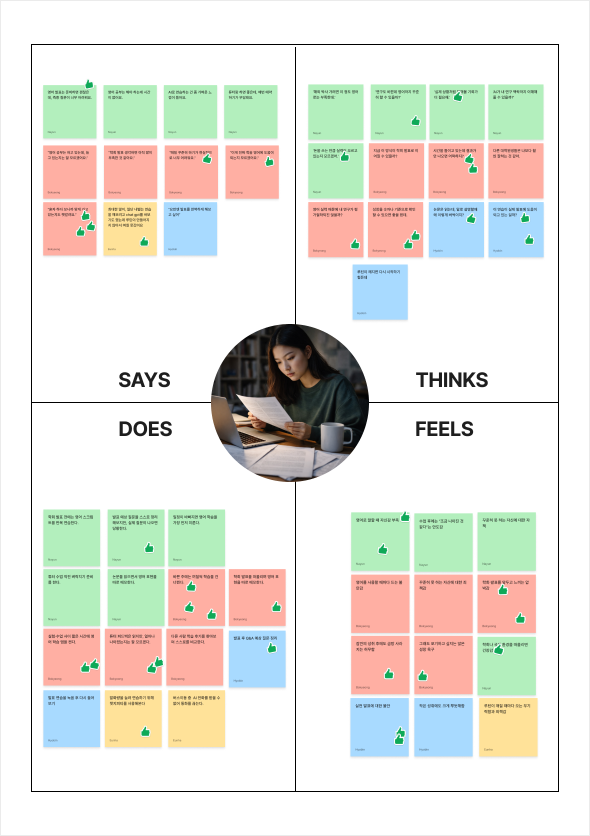
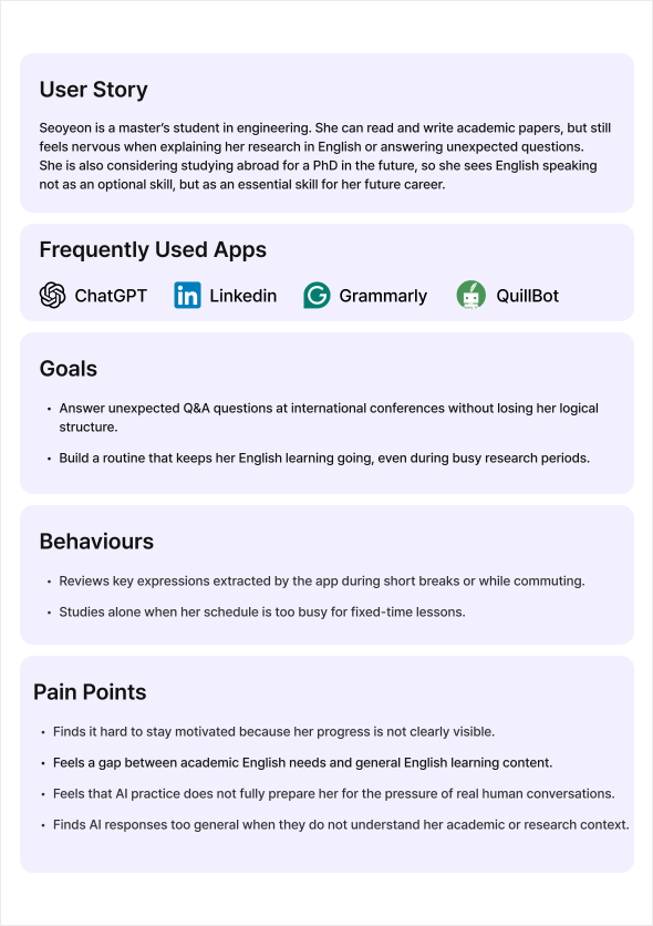
Defining a Persona for Market Growth
To reach the 20% market share goal, we defined our persona around users who need to use English in real-life situations. This helped us choose AI Phone English over a general AI tutor, as it better supports realistic speaking practice, context-based guidance, automated review, and visible progress.
COMPETITOR ANALYSIS
Understanding How Competitors Keep Users Practising
English speaking remains a major pain point for Korean English learners, creating an opportunity for both user value and business growth. I analysed competitors by looking at what happens after speaking practice, focusing on how they support review, show progress, and encourage users to return beyond push notifications.
HOW MIGHT WE
How might we turn AI speaking feedback into clear next steps, so users can build a consistent practice habit?
IDEATION & 2x2 MATRIX
Turning AI Phone Calls into Goal-Based Practice
We explored ideas that could turn AI Phone English from general speaking practice into a personalised learning loop. The ideas focused on goal-based entry, realistic speaking simulations, feedback-led review, and visible progress.
UI Decisions Based on UX Directions
01.
Start with the user’s goal and context
Users begin from a real speaking goal and short topic input, so the experience feels immediately relevant to their needs.
02.
Simulate realistic speaking situations
AI Phone recreates real speaking pressure through uninterrupted mock sessions, role-based callers, and natural conversation flow.
03.
Turn feedback into visible progress
Feedback is designed to show improvement over time through diagnostic reports, session-to-session comparisons, and simple progress indicators.
04.
Make review and restart easier
Review is simplified into key expressions, saved patterns, and better restart support, reducing the effort needed to continue learning.
WIREFRAME
Designing the Practice-to-Review Flow
I structured the flow from goal selection to AI phone practice, feedback review, and progress tracking. The aim was to make the learning experience feel clear, connected, and easy to continue.
INDUSTRY CRITIQUE
Validating the Practice-to-Review Flow
Our team shared the flow with industry professionals to validate whether the learning journey felt clear, connected, and practical in a real product context. The critique helped us review how users move from goal selection to AI phone practice, feedback review, and progress tracking.
Mid-fidelity wireframe
USABILITY TESTING / SUS EVALUATION
How the redesigned review experience helps users make better judgments
We conducted a usability test with five participants to evaluate whether the redesigned review experience helped users quickly understand reviews, judge their trustworthiness, and choose books with more confidence. I also used the SUS questionnaire to measure perceived usability and compared it with participants’ observed behaviours and verbal feedback.
What We Needed to Prove Better
01
Prioritise user feedback by showing who mentioned each problem and how often
We could have strengthened the evidence by connecting survey findings with market research, competitor analysis, and FGI. This would have shown that the user need was a meaningful market problem, making our product direction more convincing.
02.
Make the value of AI Phone clearer before introducing its features
Before introducing features, we could have clarified the core direction of AI Phone. The focus was not simply adding calls, but showing how Ringle could make AI speaking practice better through remembered context, natural responses, and tutor-like guidance.
03.
Prove with clearer numbers how the features could lead to paid conversion
The winning team estimated the target market size and ran additional usability testing before and after introducing the features. By showing how much purchase intent increased, they made the link between the proposed features and paid conversion more convincing.
04.
Show execution potential through a prototype that works like a real product
Ringle defined a strong proposal as one that does not leave the audience with unanswered questions. Beyond presenting the potential of an idea, the proposal needed to clearly justify the user scenario, the need for each feature, and the path toward paid conversion.
TAKEAWAY 01
Wireframes can explain the idea, but prototypes can prove how the experience actually works
This project taught me that strong design deliverables should reduce doubt, not just meet the brief. While our team met the wireframe requirement, the winning team went further with an interactive prototype that made the user flow, scenarios, and execution potential easier to understand and believe. It helped me see fidelity as a strategic choice for making a proposal more convincing.
IF THIS PROJECT IS CONTINUED
Strengthening Validation over Expansion
To take this project further, I would prioritise validation over addition. While we have the core flow ready, the goal is to prove its success through data and interaction. I plan to rank user problems by frequency to find the most critical gaps and build an interactive prototype to test the complete loop. My focus is to confirm that the experience isn't just functional, but compelling enough to increase willingness to pay.
TAKEAWAY 02
Show user feedback as ranked evidence, not a list of separate comments
As a designer, I learned that user research should not only capture what users said, but also help prioritise design decisions. Instead of presenting comments separately, I needed to show which problems appeared most often, which user groups experienced them, and why they mattered. This would have made the reason behind each feature clearer and easier for stakeholders to trust.
EXPLORE MORE WORK